If you are in Freelance Recruiting and want to take your business to a new level, you should work on your findability and your public image. An effective way to do this is with your own website. Alongside your LinkedIn profile, it forms your digital presence. In this article, we look at what you should pay attention to.
Your own website: What do you need it for?
Having your own website puts you as a freelancer in the spotlight. Because you are the product that your customers buy. They are buying your expertise, your skills, your network and you as a person. You can express all of this on your website and give new and existing customers an overview of who they are dealing with. This looks professional and also boosts your customer acquisition. Potential new customers in particular can obtain extensive information on your website before they speak to you directly. Essentially, your website is about brand building, branding and sales.
Your own website: How do you create it?
Today, you no longer need your own software developer to create your own website. There are various website builder systems that you can use for this. These range from WordPress to Wix.com or Jimdo. Just try out which templates you like and how you get on with the respective tools.
A meaningful domain is of course important for your own website. Your name is usually a good choice here (www.maxmustermann.de). There is probably no better branding. However, you could also choose a fantasy name or your specialization (e.g. www.phprecruiter.com) in the focus.
Example and analysis: christinawilbert.de
To give you a better picture of a good website, we will analyze the website of Christina Wilbert (www.christinawilbert.de). Christina is a consultant and trainer in recruiting and offers a very good example of a successful website.
Website analysis: Structure & organization
The structure and layout of the website are well done in that they provide all the information clearly without being overloaded. The homepage includes the logo at the top left, the telephone number and the menu in the header, as well as a heading H1 ("Coaching, consulting & training") and the selection "For individuals" and "For companies".
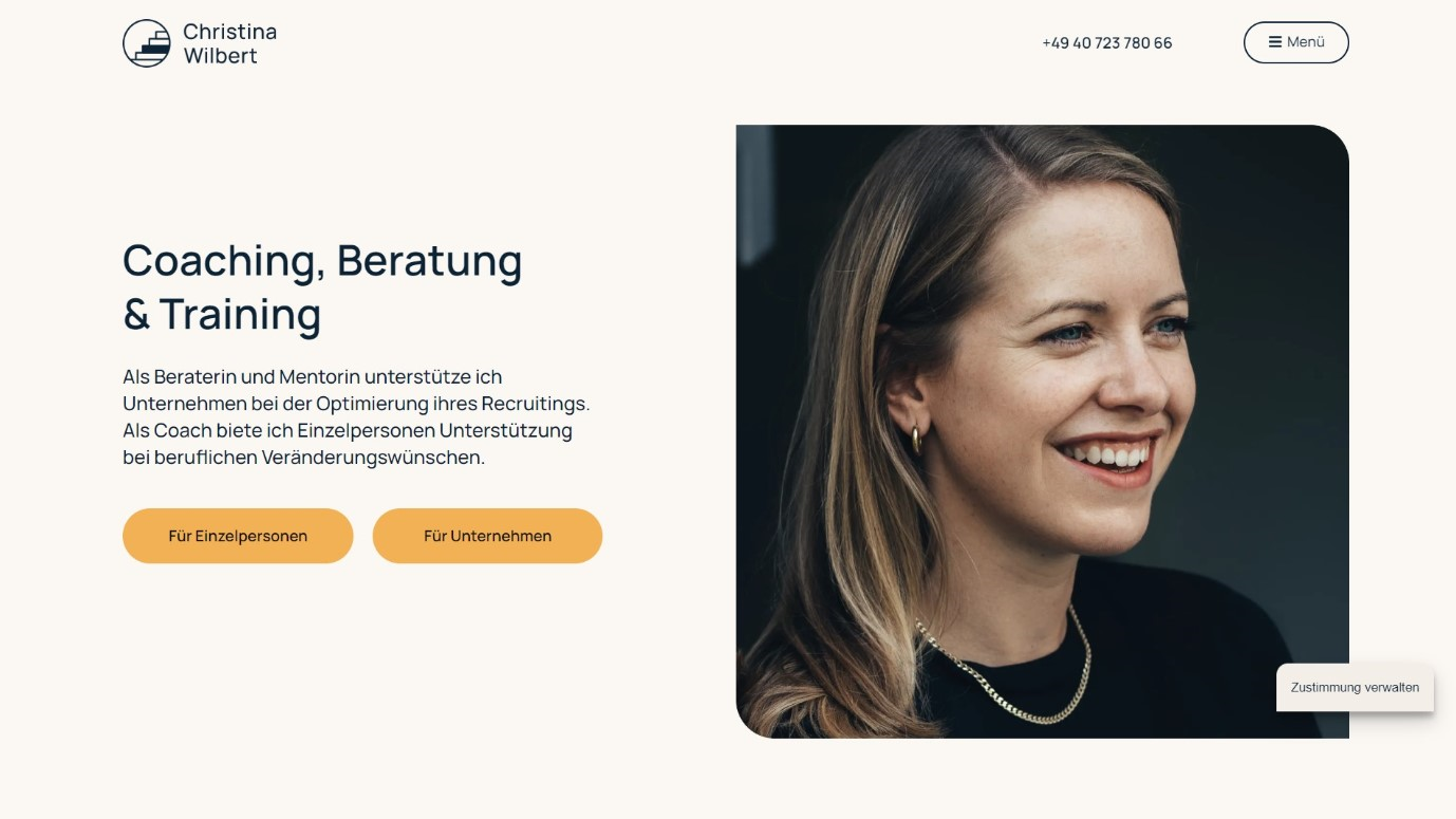
The two buttons pick up the visitor directly and lead them in their desired direction without having to search for a long time. This differentiation is continued throughout the website, both on the home page and via the menu, so that the visitor is always directed to their respective interest. As a result, every interaction leads to a call-to-action (CTA). As a website operator, you want to encourage your visitors to find out more and then do something. This could be, for example, registering on the website or, as in this case, contacting Christina.
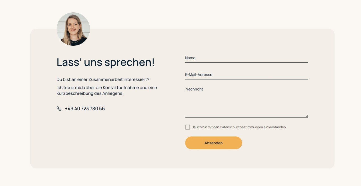
Christina offers both written and telephone contact for this purpose. The integration of the telephone number in the header, which can be seen at any time when scrolling, is very good. Remember: Make it as easy as possible for your visitor to contact you at any time. Especially in the business-to-business (B2B) sector, your visitor is on your website for a reason. Perhaps they are looking for new suppliers or comparative offers. They can quickly pick up the phone and talk to a potential new customer. Here it is even a good idea to communicate a clear order to the visitor. A "Call me!" or "Write me a message!" has even more of an effect on the visitor than simply displaying the contact details. Christina uses this in her CTA at the end of the website with "Let's talk!". Inclusion in the header may also be an option.

She also creates a continuation of contact options via cross-references to her LinkedIn and XING profile in the footer of the website. Here you can find out more about Christina, read her posts and get in touch with her.
Website analysis: Branding
Christina has chosen a very appropriate branding for her public image. The website, just like her LinkedIn posts and certainly also corresponding presentations, always carry the same colors and fonts. She uses a warm beige as the main color, a slightly darker beige as a secondary color and yellow as an accent color. In UI design, the 60-30-10 rule is used to create harmonious and balanced color ratios. 60% of the content is the main color (here: light beige), 30% is the secondary color (here: dark beige) and 10% is the accent color (here: yellow), which is mainly used for the CTA. The integration of a blue tone during mouse-over, i.e. when you move the mouse over an interactive element, makes a lot of sense in terms of contrast and is also visually very balanced. The choice of color is also very well matched to the photos used and offers a good contrast to the font color used (dark blue).
Christina uses her own name as the domain for her website (www.christinawilbert.de). This makes a lot of sense for personal branding. Especially when you google her, her website is displayed at number 1. She also came up with her own logo, which fits in with the branding in terms of both color and content. The staircase within the circle symbolizes the ascent and thus fits the respective target groups of individuals (climbing the career ladder) as well as companies (success through better recruiting). The color and style fit into the overall structure and appear modern.
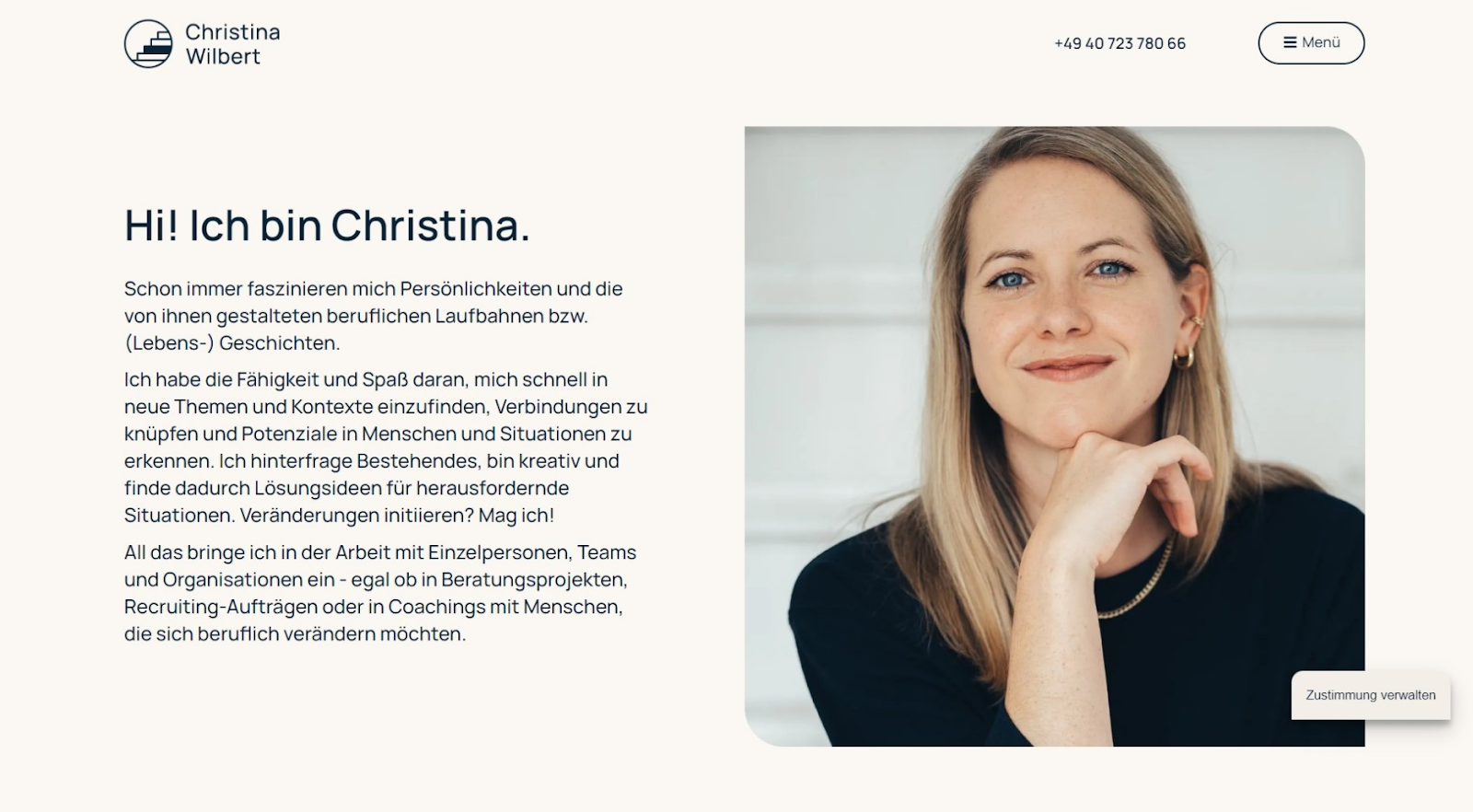
Another point regarding branding is that Christina uses first names on her website and also in her LinkedIn posts. The question of "you" or "you" is always one that you should ask yourself at the beginning and then follow through constantly. The "you" creates closeness, the "you" creates distance. For Christina's area of coaching in particular, it makes sense to create closeness right from the start. Furthermore, it fits in with the current times and her overall appearance that she is on first-name terms.
Website analysis: Sales
As already described, your website has one main goal and that is to sell. As the first point of contact for potential new customers, it should already contain all the relevant information that is important for your customers. These are above all:
- Who am I dealing with?
- Why should I employ this person?
- What can I expect?
- What will it cost me?
Christina answers all these questions on her website. She introduces herself with her CV and her previous projects ("Who am I dealing with?"). She describes the client's challenges and offers solutions ("Why should I employ this person?"). She describes what someone can expect from coaching, for example ("What can I expect?"). And it shows various price packages including prices.
As a visitor, I am guided through the entire process. I understand who I'm dealing with and why she can solve my problems, how she goes about it and what it will cost me. This concludes with a CTA that prompts me to get in touch.
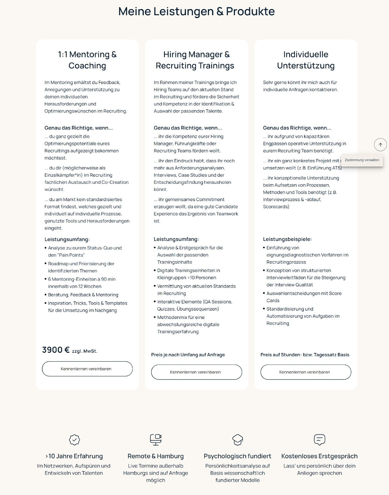
What she also does well is to put the prices in relation to each other. Directly after the price overview, she has included a summary that explains the prices. This way, the visitor is not left thinking "That's expensive", but is directly put back into the situation that they are receiving "over 10 years of experience and psychologically sound work".
Website analysis: potentials & options
Christina has created a very good website and a strong general public image that goes hand in hand with her branding. But is there anything she can do even better? And what options are there for developing her website further?
An important component of a website is "social proof". We humans simply work in such a way that we like what others like. On websites, this works primarily through testimonials and customer logos. Christina already describes a selection of her clients in her professional career, such as New Work SE, IDnow, ThyssenKrupp Management Consulting and Tomorrow Bank. She could present these more prominently with logos. Logos and images are easier to recognize than plain text. There may also be testimonials from these companies that she can include here.

As described above, it could also formulate the CTA in the header more clearly. From just a phone number to an "invitation" to get in touch. This will subconsciously encourage visitors to do something.
To expand her website, she could consider implementing a recruiting blog. With a target group-oriented and SEO-optimized blog, she can gain more reach with her website and thus potential new customers. The search engine links for blog articles then lead visitors directly to her website and thus to her offer. She could also do the same in the form of guest articles that link her and her website to the article.
Own website: Conclusion
Your own freelance recruiting website is your tool for branding and acquiring new customers. It gives you a new level of professional image and reach for new customer acquisition. If your branding runs through your website, your LinkedIn presence and your documents, such as presentations, your customers will be able to identify with it and contact you. Take advantage of online discoverability and let potential new customers find you. Use Christina's website and other freelancers you come across as a guide. They usually use a similar scheme. Above all, remember to answer the potential client's questions when creating your website:
- Who am I dealing with?
- Why should I employ this person?
- What can I expect?
- What will it cost me?

FAQ
How do I create a website as a freelancer?
You can easily create your own website with WordPress or similar tools such as Jimdo or Wix.com. Think about your personal branding and present your offer. Take a look at the example in this article.
How much does it cost to have your own website?
The costs for your own website vary depending on how much you do yourself. With tools such as WordPress and the like, you can easily manage with €20 per month. If you hire an agency to create your website, it can cost several thousand euros.
Is it difficult to create a website?
In principle, anyone can create a website these days. Tools such as WordPress, Wix.com or Jimdo offer simple solutions for creating a website yourself.